Challenge
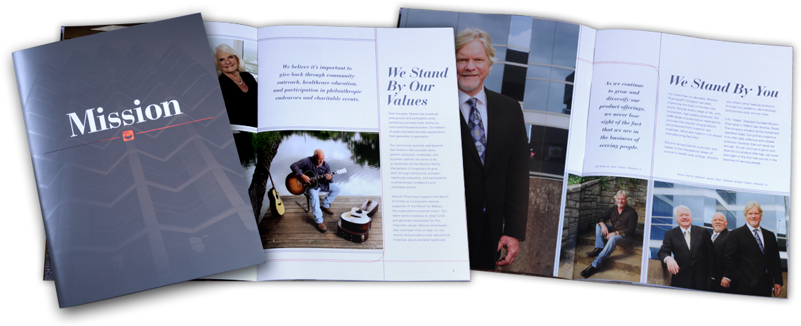
Mission Pharmacal manages many over-the-counter and prescription brands from R&D to marketing. They were in need of one congruent print brochure that spoke of all of their brands and services while also speaking of their rich history and futuristic strategies.
Solution
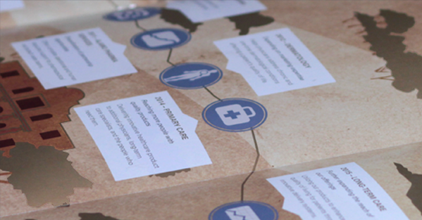
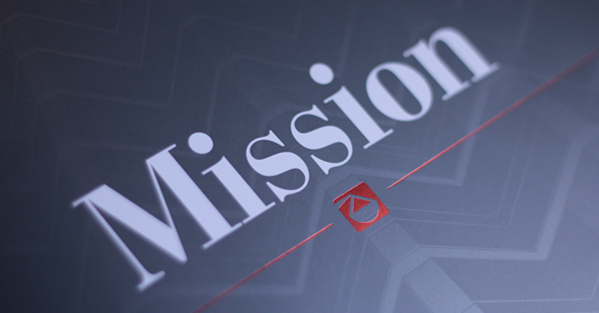
Shovel Creative worked with DeeterUSA to create a 34 page brochure (including a fold-out spread) that incorporated Mission Pharmacal’s rich history and futuristic strategy with a combination of bronze and silver metallic inks. The cover is a photograph of their corporate headquarters in a 2-tone metallic silver (looking almost like a rocket ship) with a red foil stamp of their logo. The center spread fold-out boasts of their rich history in an old vintage map texture and bronze metallics, metaphorically laying out their brand categories along the Mission Trail. Other interior pages bring the silver and bronze metallics together in parallel lines running through text and custom photography.
• Brochure Layout & Design


